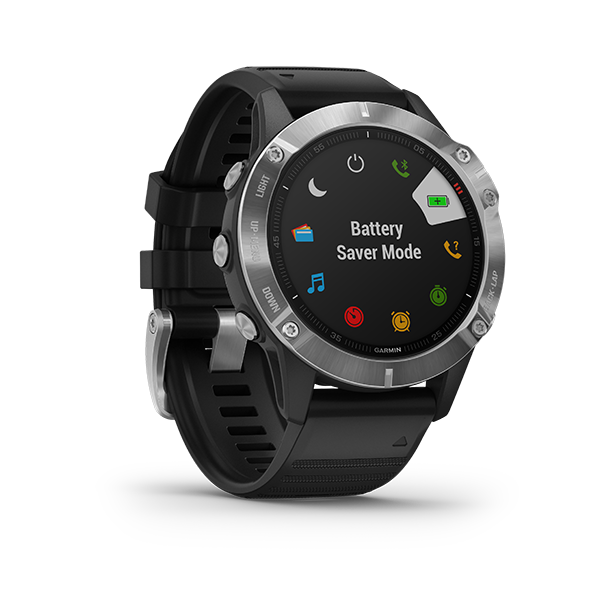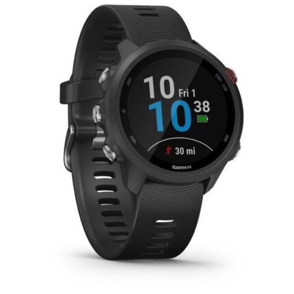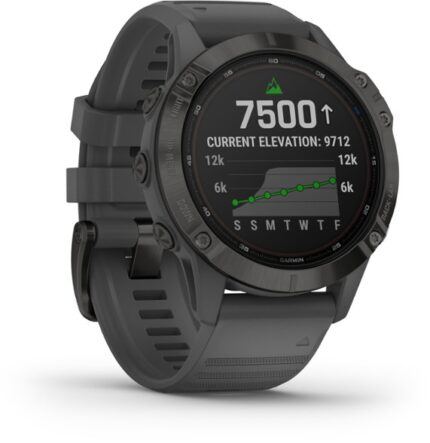

Garmin Fenix 6
KSh 69,999.00
Key Features;
- 1.3 inch, 240 x 240 display
- Available with steel, titanium bezel
- Interchangeable 22mm bands
- Up to 36 hours GPS battery
- Includes Pulse Ox sensor
- Waterproof up to 100m
- 24/7 activity tracking
- Multisport profiles
- PacePro running feature
- Battery saver mode
Garmin Fenix 6: Design and interface

The Fenix 6 isn’t too much of a break from the overall design language of the range – but it has been improved in nearly every way. Whether you go regular, pro or solar, it weighs in 83g for the steel version or 72g with a titanium case to make it lighter than the Fenix 5

Away from the hardware, Garmin has been making improvements on the operating system front that will change the way you interact with the Fenix 6. In a good way. The menus have been given a lick of paint making them more useful than before.
Scrolling down through your daily data offers more of an overview, so instead of cycling through single screens for every metric (training status, weather, calendar, heart data), they’re presented as a list so information is more glanceable.
Garmin Fenix 6: Mapping and navigation

In addition, zooming in and out is a painful experience on the watch, requiring a combination of button bashing not witnessed since entering Mega Drive cheat codes. There’s no pinch and zoom as the Fenix isn’t touchscreen, so having a quick zoom out requires serious effort.Buy the Garmin Fenix 6 Best price online from CELLULAR KENYA,Nairobi
If you’re mapping yourself via a GPX, it does make the experience a lot better, but it’s one that ironically works better with the sprawl of roads in built up areas, rather than out in the wilderness. Where previously we’ve struggled to navigate through cities using GPS waypoints, that’s improved immeasurably by the mapping.
Garmin Fenix 6: Running

The great thing about the Fenix is that it puts everything you get from Garmin’s Forerunner watch range into a more durable and robust design. The big difference between something like the Fenix and Garmin’s top end Forerunner has been the difference in size. But that difference in stature is not as extreme as it once was.
Related products
Garmin Forerunner 35 GPS Running Watch
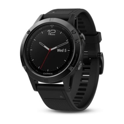
Garmin fenix 5X GPS Watch
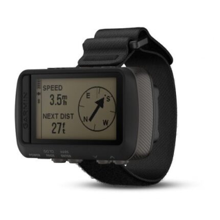
Garmin Fortrex 601 Smartwatch
| PHYSICAL DIMENSIONS | 2.9" x 1.7" x 0.9" |
|---|---|
| DISPLAY SIZE | 2.0" diagonal |
| DISPLAY RESOLUTION | 200 x 128 pixels |
| DISPLAY TYPE | high-resolution 4-color gray |
| WEIGHT | 3.1 oz with batteries |
| BATTERY TYPE | 2 AAA batteries (not included) |
| BATTERY LIFE | exceeds 48 hours in GPS mode Up to 1 week in UltraTrac™ mode Up to 1 month in watch mode |
Garmin D2 Air GPS Smartwatch
- Flight Navigation & Aviation Information
- Flight Logging & Barometric Altimeter
- 1.2" AMOLED Display & Gorilla Glass 3
- Built-In GPS & Over 20 Sports Modes
- Up to 5 Days of Battery Life
- Heart Rate Monitor & Pulse Ox Sensor
- Water Resistant Up to 164'
- Sleep Monitoring & Stress Tracking
- Built-In Storage for Audio Playback
- Smart Notifications & Garmin Pay
Garmin vivoactive 3 Music
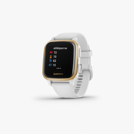
Garmin Venu Sq GPS Smartwatch
- Up to 6 Days of Battery Life
- 20 Pre-Loaded Sport Modes
- Integrated GPS Tracking
- Play Music from Smartphone
- Pre-Loaded Workouts or Create Your Own
- Water Resistant Up to 164'
- Pulse Ox Sensor & Sleep Tracking
- 1.3" Color LCD
- Corning Gorilla Glass 3 Protection
- Receive Call, Text & Other Notifications
Garmin Forerunner® 245
Garmin fenix 6 Pro Multisport GPS Watch
- Includes wrist heart rate tracking and Pulse Ox sensing blood oxygen saturation
- Pulse Ox
- Supports GPS
- Always-on 1.3 inches display with bezels in stainless steel
- Garmin Pay™ contactless payments
- Music storage with premium streaming service
- Battery use: up to 14 days in smartwatch mode, up to 10 hrs. in GPS and music mode

